03 — Type
Typography
A serif for authority, a tracked-out sans for structure, and a monospace for anything technical or numeric.
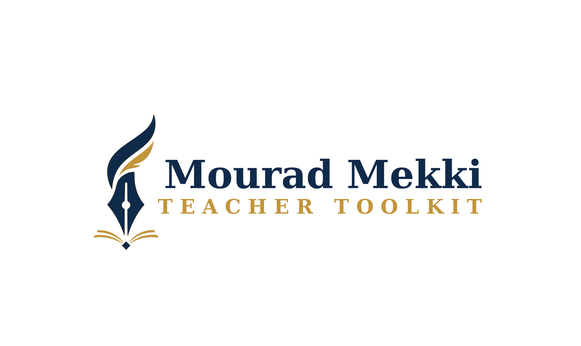
Display — Fraunces, SemiboldWordmark & headlines
Mourad Mekki
Teacher Toolkit
Body — Geist / Inter, RegularParagraphs & UI copy
Used for everything read at length — descriptions, interface labels, and body copy across every OwlMark studio and platform. Clean, quiet, never competing with the display face.
Mono — JetBrains MonoHex values, code, data
#102A4A · #C3953B · #F5F1E6 · v1.0
Pairing rule
Fraunces carries the name. Never set the subtitle or body copy in Fraunces — it's reserved for the wordmark and section headlines only.
Tracking
Subtitle text ("Teacher Toolkit") is always set in gold, uppercase, with generous letter-spacing — roughly 0.2–0.25em.
Arabic
أ. مراد المكي — with the definite article ال, always. Never مراد مكي.